طراح و مجری:
استودیو آرانو
کارفرما:
جناب آقای اقتداردوست
نوع پروژه:
هویت بصری برند
مساحت:
–
موقعیت:
تهران
زمان پروژه:
خرداد 1403
[ معرفی پروژه ]
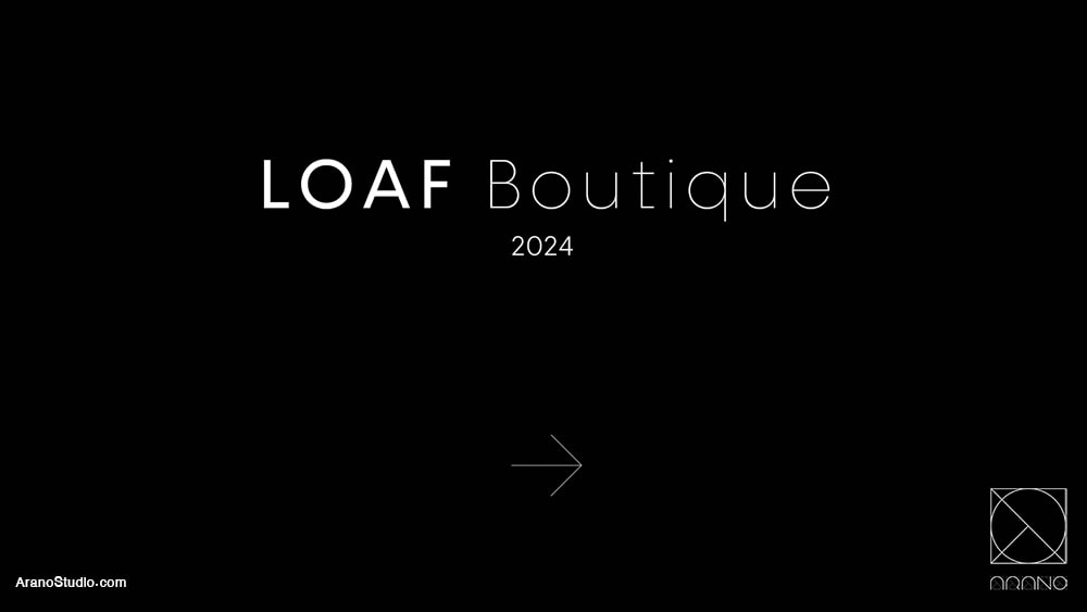
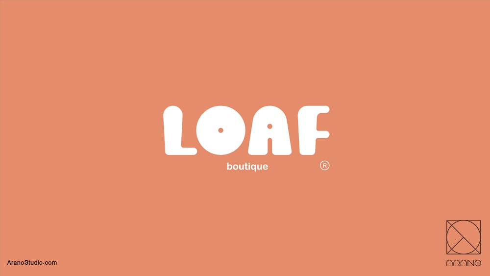
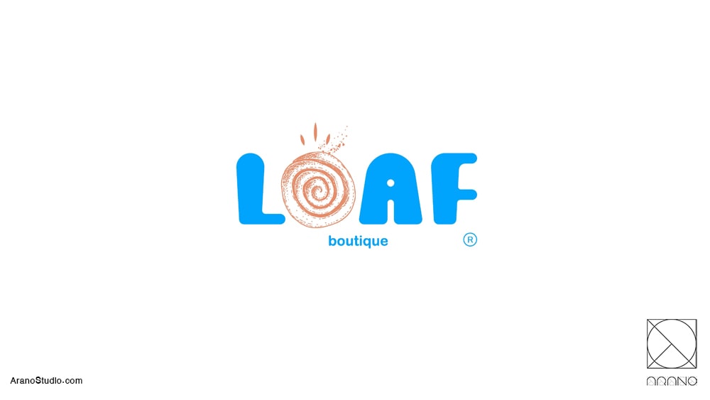
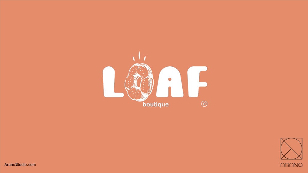
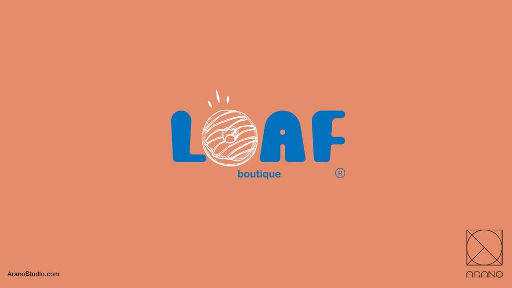
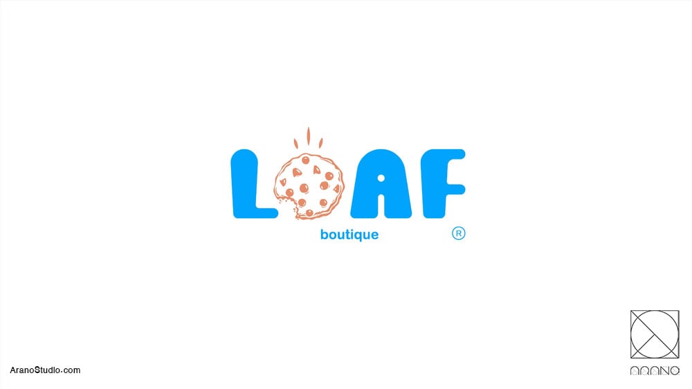
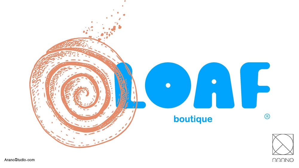
هویت بصری کافه بیکری لوف
روند طراحی
طراحی هویت بصری کافهبیکری لوف با هدف ایجاد تجربهای مدرن، جوانپسند و بهیادماندنی شکل گرفته است. در این پروژه تلاش شده تا فضایی خلق شود که نهتنها حس تازگی و انرژی مثبت را به مشتریان منتقل کند، بلکه بازتابدهندهی کیفیت و خلاقیت محصولات لوف باشد.
رنگها:
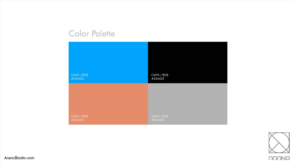
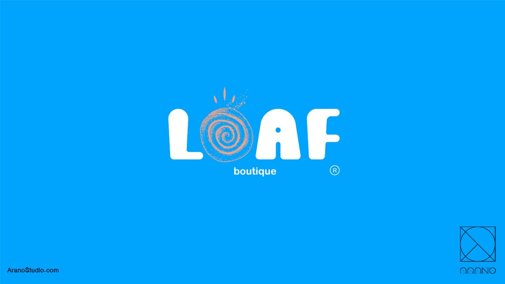
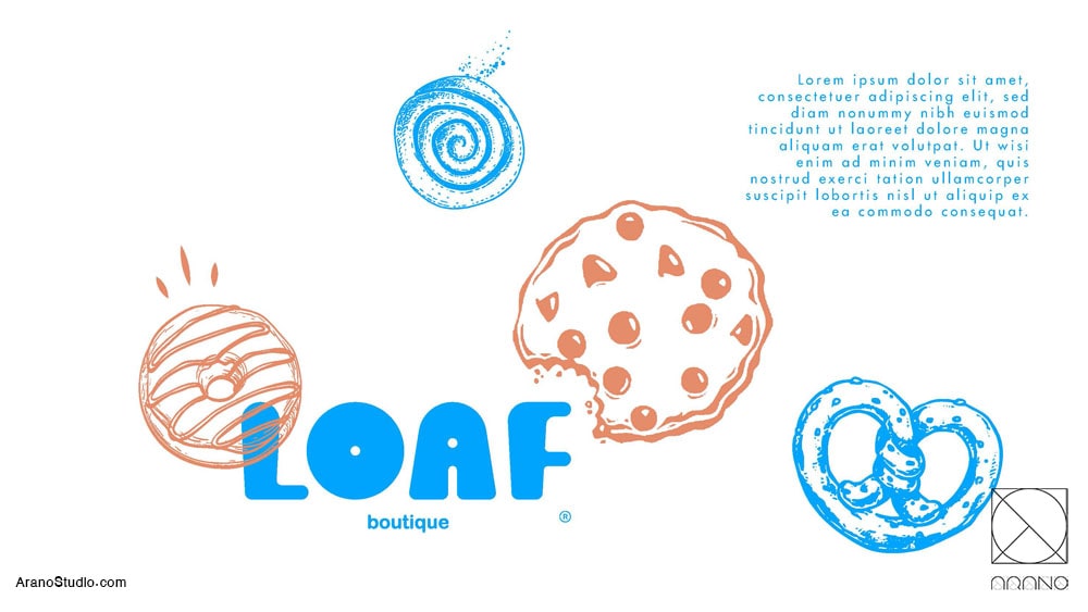
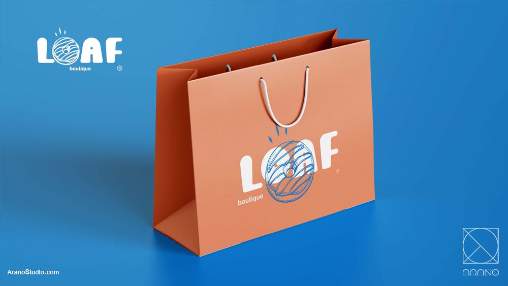
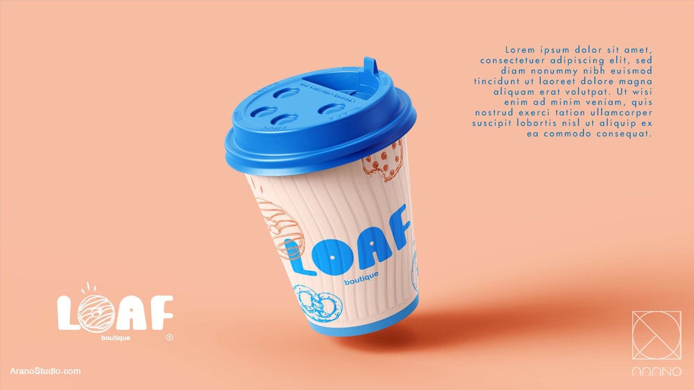
پالت رنگی شامل رنگهای شاخص و چشمنواز انتخاب شده تا توجه مخاطب جوان را جلب کند و فضای پرانرژی و شاد کافه را بازتاب دهد. رنگهای گرم الهامگرفته از بافت نان تازه و شیرینیهای طلاییرنگ، در کنار رنگهای مکمل مدرن، حس صمیمیت و خلاقیت را تقویت میکنند.
الگوها و عناصر گرافیکی:
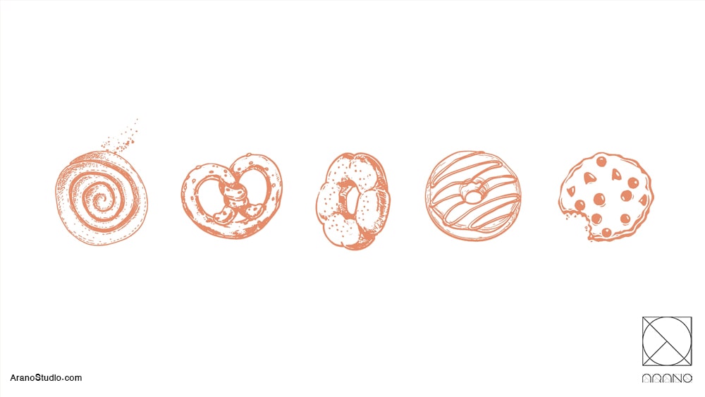
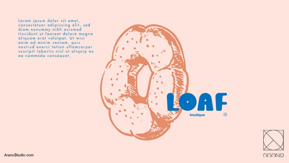
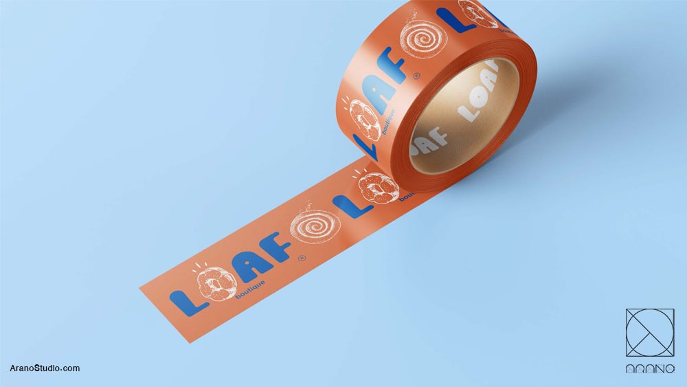
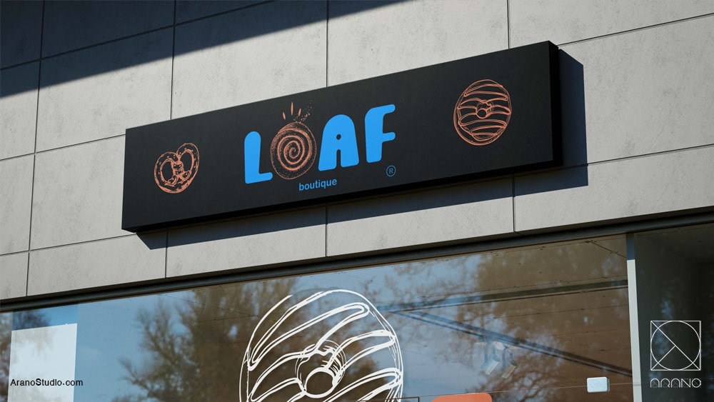
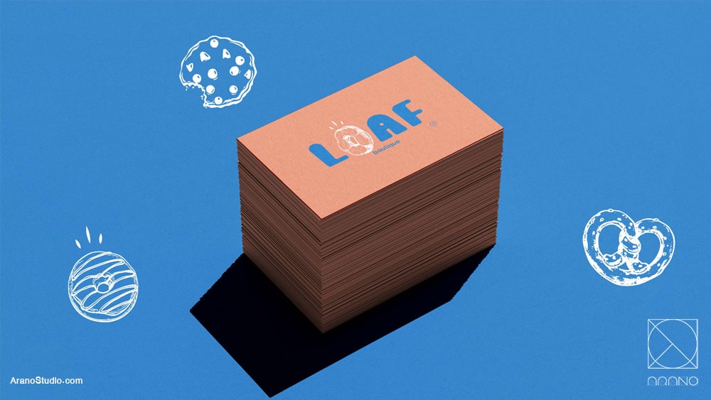
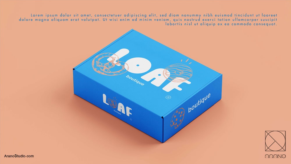
در طراحی از الگوهای الهامگرفته از فرم نانها و شیرینیها استفاده شده تا ارتباط بصری مستقیمی با محصولات برقرار شود. این الگوها در بستهبندی، منو، دیوارنگارهها و حتی عناصر دیجیتال (شبکههای اجتماعی) حضور دارند و برند را بهصورت منسجم به مشتری معرفی میکنند.
فونت و تایپوگرافی:
فونتهای انتخابی ساده، مدرن و خوانا هستند تا حس بهروز بودن را تقویت کنند و با روحیه مینیمال طراحی هماهنگ باشند. ترکیب تایپوگرافی و رنگها باعث میشود نام «لوف» بهراحتی در ذهن مشتریان حک شود.
نتیجه:
این هویت بصری باعث میشود کافهبیکری لوف نهتنها مکانی برای خرید نان و شیرینی، بلکه تجربهای کامل از یک فضای جوانپسند، خلاق و بهیادماندنی باشد؛ جایی که مشتری با دیدن هر عنصر گرافیکی یاد لوف بیفتد و ارتباط احساسی با برند برقرار کند.
معماران: بهنوش مرادی، امین رفعتی
طراحی هویت بصری: سید مهرداد موسوی
کارفرما: جناب آقای اقتداردوست
سال طراحی : 1403
The visual identity of Loaf Café & Bakery has been crafted to create a modern, youthful, and memorable experience. The goal of this project was to design a space that not only delivers a sense of freshness and positive energy but also reflects the creativity and quality of Loaf’s products.
Colors:
A vibrant and eye-catching color palette was selected to attract the attention of a young audience and reflect the lively atmosphere of the café. Warm tones inspired by the golden hues of freshly baked bread and pastries are paired with contemporary accent colors, creating a feeling of warmth, friendliness, and modern energy.
Patterns & Graphic Elements:
The design incorporates patterns inspired by the shapes and textures of bread and pastries, visually connecting the identity to the core products. These elements appear consistently across packaging, menus, wall graphics, and digital platforms, ensuring a cohesive and recognizable brand presence.
Typography:
Clean, modern, and easy-to-read fonts were chosen to reinforce the brand’s fresh and up-to-date character. Combined with the bold color palette, the typography ensures that the name “Loaf” remains memorable and visually impactful.
Outcome:
This visual identity turns Loaf Café & Bakery into more than just a place to buy bread and pastries – it creates a full experience for young, creative customers. Every visual element reminds them of Loaf, building a strong emotional connection with the brand.
Architects: Behnoosh Moradi, Amin Rafati
Visual Identity Design: Mehrdad Mousavi
Client: Mr Eghtedardoust
year: 1403